How to build your Squarespace website efficiently: Essential Tips and Tricks for Squarespace Website Owners
Building a website on Squarespace can be a daunting task, especially if you don't have any prior experience. However, with the right tools and techniques, you can create a professional-looking website in a short amount of time.
Squarespace is one of the best website tools for building a website quickly and efficiently. Squarespace is a website builder that offers a wide range of templates, features, and design options to help you create a website that is tailored to your needs and is easy to use. It has a drag and drop editor which allows us so much control in our design layouts, but if you don’t know the pitfalls, it can cause some frustrations.
In this blog post, we will discuss how to efficiently build a website in Squarespace by using these expert tips and techniques.
1/ Start with a Squarespace template that most closely matches the style and content you are going to have on your website
Squarespace has a great number of pre designed templates that are geared to specific businesses and have the pages and content that would be suggested for those businesses. Starting with one of these templates and then just replacing images and text would be a very quick way to not only build a website, but to have a guide as to what content might be good to have on your business website.
To use one of the premade templates in Squarespace:
Go to squarespace.com and click the “Get Started” button in the top right
Squarespace will ask you some questions to aid you in your template selection:
You can provide some details here or click the “I’m just browsing” button to go directly to the predesigned templates:
Click the selections that apply to the site you will be building to see the ready made templates.
Hover over a template and choose “Preview this template” to look at the pages on this template to see if it appeals to you. Keep in mind that you can change any styles on any template - colors, fonts etc, but if you start with a template that is closest to what you are going for it is going to save you some time in the long end.
Once you have found a template that works for you click on “Start with this Design”.
Tip: In Squarespace 7.1 there is only 1 base template meaning any site can be set up any number of ways. These predesigned templates have just been set up using the same starting point, but the fonts, colors and layouts as well as content have been adjusted to create a unique look. Once you have picked a template you cannot then undo it and go back to choose a different template.
***** New feature alert *****
Squarespace just introduced Squarespace Blueprint that actively guides you through the creation of a base template by giving you choices for the sections on your Home page and footer and helping you create a base site quickly.
The section choices are a bit limited I found but you can always add or change them later!
2/ Set up your color theme and fonts for your website so you only have to do it once and you will be able to make your site look consistent
The first thing you will want to do is select the colors and fonts that best represent your website and brand. This will allow you to add sections later on that are already set up with your brand colors and will make your site look cohesive and professional.
From the main menu select “Design” and then “Site Styles”.
Select “Colors” and you will see something like this:
Select “Edit palette” under the color options and then click on each individual color to set your template base colors.
The color themes that appear underneath will reflect the base color changes when you have set your colors. You can then go into each color theme and adjust any individual color of elements as desired.
I find it helpful to set up a “Site Styles” page that has one section for each color theme. Within each section I have each Heading option, each paragraph option, a line block, a quote block and the 3 button types. Then I just duplicate the section and select the next color theme until I have used each color theme. Here is an example:
Squarespace has a very detailed tutorial about changing colors here.
After you have set your colors, return to the Site Styles panel and choose “Fonts” to change the fonts on the template (if desired).
You can either change all the fonts at one time by clicking on “Switch” beside FONT PACK or you can change just the headings or just the paragraph fonts by clicking on those options. Squarespace has very detailed help on changing fonts in this helpful tutorial.
Tip: Try to only use 2 font families as adding font files to your website slows it down.
Once you have you site styles setup, we are ready to start adding sections and content. In order to take advantage of the following tips let’s define what sections are in Squarespace..
What are Sections in Squarespace?
Each web page in Squarespace contains as many sections as you want. The Header is a section, and the body of the page can have as many sections as we want as well as the footer area.
For each section we can have any number of content blocks within the section such as images, text, buttons, form blocks and more. Add any block by clicking on the button in the top left of the section labelled “Add block”.,
We can style each section by setting a color theme, adding a background color, and many other settings via the “Edit Section” menu.
When you are creating a web page you will see the “Add Section” button in blue and a blue outline around each section to identify where a section starts and finishes.
3/ To quickly create web pages in Squarespace, use any of the pre designed layouts provided by Squarespace.
Squarespace tries to make it as easy as possible to create your pages by giving you starting points for your pages and sections based on the type of content you want to add.
To use a predesigned pagE layout follow these steps:
Go to the Pages panel
Select the + sign to add a page to either the Linked or Not Linked section (in main navigation or not)
Select “Page Layouts”
Scroll through the available page layouts grouped by the type of content you want to add until you find one that works for you. Click on it and a new page will be created.
Name the page accordingly
Edit the page to adjust any of the content
To use a predesigned section layout follow these steps:
Edit any page on your site
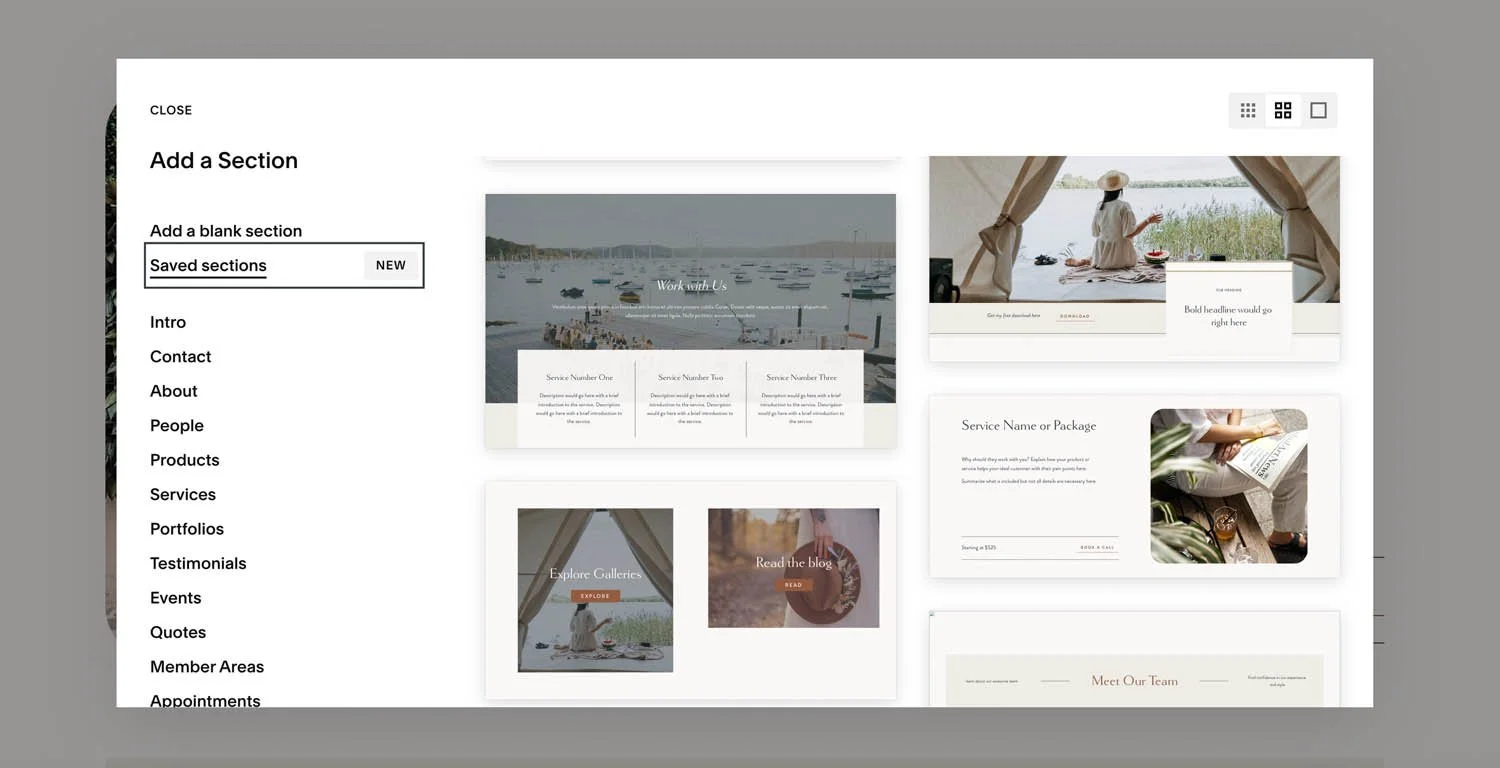
Click on “Add Section” above where you want to add a new section
Browse the available sections based on the type of content you want to add. Click on one of the layouts to add it
Edit the content to change, remove or add any content as desired
The benefit of using these pre-made layouts is not only the time savings, but it also gives you some creative ideas as how to layout content in Squarespace. Also, one of the best things is that these layouts are already set up for mobile layouts so you will not have to do as much for mobile (unless you make many changes to the content)
4/ Use saved sections
One of the easiest ways to build a website efficiently in Squarespace is to reuse previously designed sections. This means that you can use the same section multiple times throughout your website, without having to design it from scratch each time. This is one of the best new features available on Squarespace!
Start with adding your content to your sections by clicking on the “Add Content” button in the top left of the section. When you add content, it will add it to the top left of the section by default. You can then place your cursor over the block and move it to wherever you want it in the section. You can also resize the block by dragging on the frame.
Setup your layout as you wish and then click on the phone (mobile) icon in the top right to view the layout on mobile view. You can move elements around on mobile without affecting the desktop layout so this allows us much more freedom on mobile. You can also resize frames the same way. Use the arrow keys to move your elements to the correct order that you want them to appear and then if necessary layer any elements as desired.
Tip: To create custom sections efficiently, add your content and set it up the way you want it on both desktop and mobile view BEFORE saving the section
At the time of this post the maximum number of saved sections allowed is 50.
How to save a section in Squarespace:
Select the “Edit” option for the page that has the section you want to reuse
Scroll to the section you want to save.
Click on the heart icon in the top right menu in the section.
How to insert a saved section in Squarespace:
Select the “Edit” option for the page where you want to insert the section
Scroll down to where you would like the section to go
Click on the “Add Section” button and then select “Saved Sections”
Find the saved section you want to insert and then click on it
Click on “Add” at the bottom.
The saved section will be inserted onto your page and will be a copy of the original. Any changes made to it will not be reflected in the “Saved section”.
Examples of saved sections that are useful
Using our saved sections keeps our website looking consistent and allows us to layout pages quickly. For instance, if you want a testimonial section that has an image or graphic along with the quote, you can design it once and then insert it anywhere on your site and just change out the quote and image (if needed). So much quicker than laying it out from scratch each time and making sure it looks the same!
I use saved sections all the time in my website design projects as it speeds up my website build and also makes it easy for my clients to add sections themselves.
We are allowed up to 50 saved sections currently so I suggest saving any section at all that you think you might use more than once. Banners, calls to actions etc.
Here are some examples from a website redesign I did for a photographer of the types of saved sections I created for her on a Squarespace Design Day.
5/ Duplicate sections
Another option that is available to us is to duplicate a section on the same page and move it up or down the page.
To duplicate a section, click on the icon with the double squares on the Edit Section menu
Then use the arrow keys beside it to move the section up or down on the current page.
6/ Duplicate pages for a quick starting point
If you are starting a new page and know that it will have similar sections to a page that is already set up, the quickest starting point would be to duplicate the whole page. From there you can add or delete sections. Your new sections can be blank, a pre designed Squarespace layout or a previously saved section.
To duplicate a page, locate the page in the pages panel and then click on the gear icon. Scroll to the bottom of the General tab and then click on “Duplicate page”. It will create a copy of the page in the “Not Linked” section. Rename the page and give it the proper URL name as well. Then edit the page and proceed to add or remove sections.
7/ Copy and paste content
If you just want to copy a bit of content and retain the formatting, from one section to another we can use the copy and paste option in Squarespace.
To copy and paste content from one Squarespace section to another Squarespace section, follow these steps:
Edit the page that has the content you want to copy
Select the content you want to copy: Highlight the text, images, or other content you want to copy. To select the content you can drag over the elements or click on one element and then shift+click to keep adding additional elements.
Copy the content: use the keyboard shortcut Ctrl+C on a PC or Command+C on a Mac.
Open the section where you want to paste the content and Paste the content by using the keyboard shortcut Ctrl+V (Command+V on Mac).
In conclusion
Building a website in Squarespace can be an efficient and streamlined process if you know how to take advantage of these features. Not only can you save time and effort but you will have a more professional looking website that reflects your brand.
Still struggling with making your site look professional? Explore my Squarespace Design Day service to give your site the tune up it needs.


