Annie Sharp Photography Website Design
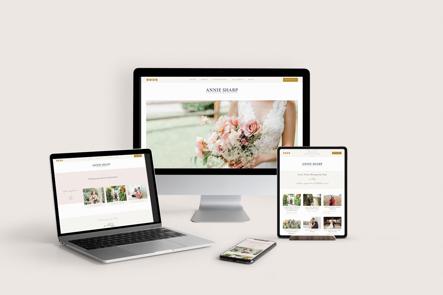
This was a fun redesign for a photographer who specializes in Wedding and Lifestyle Photography. Deb came to me with an existing Squarespace website that just did not match the feel of her brand anymore and it was on an old template with a narrow width design. She wanted something feminine and airy to reflect her photography and the new site really delivers that!
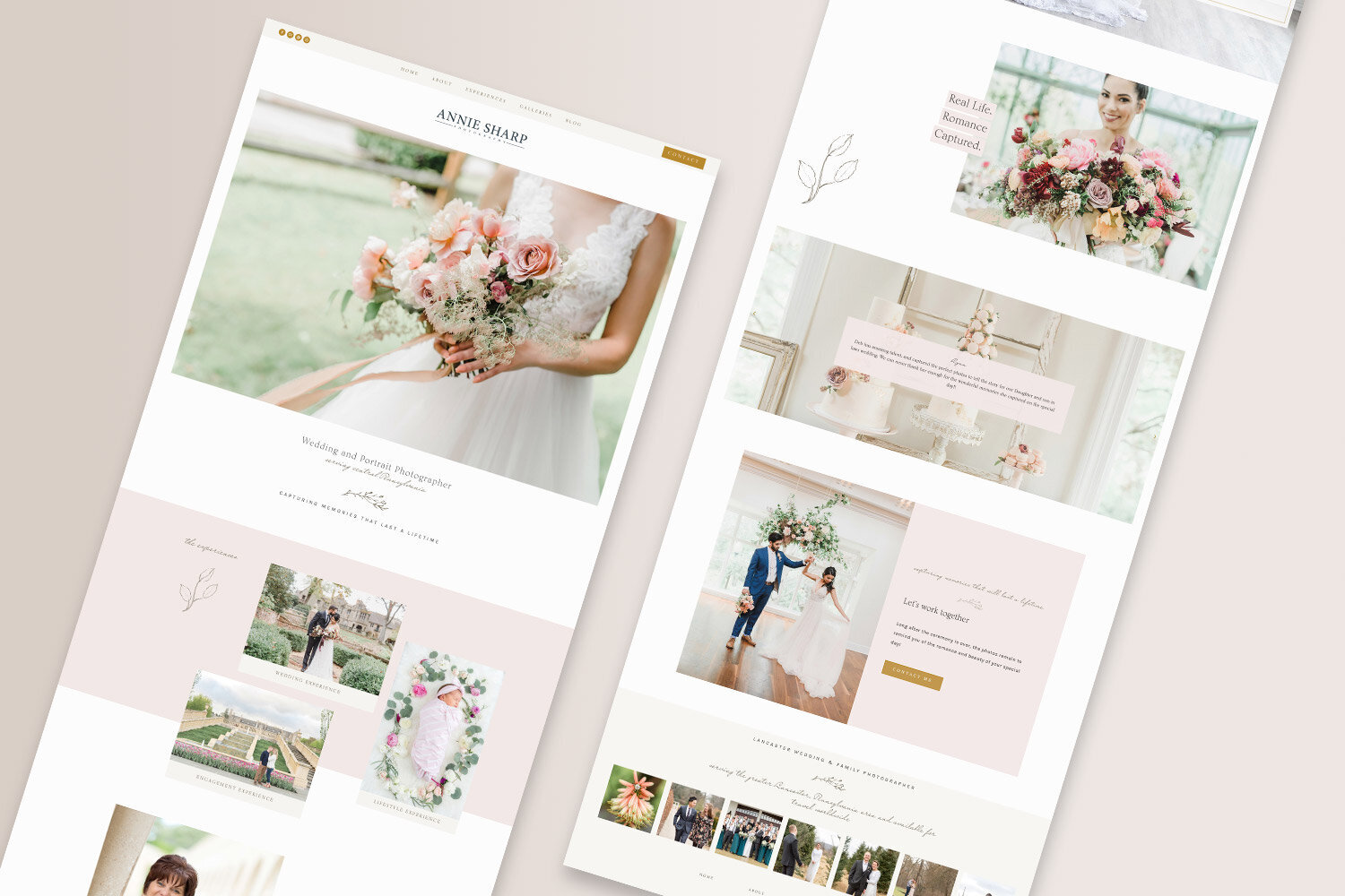
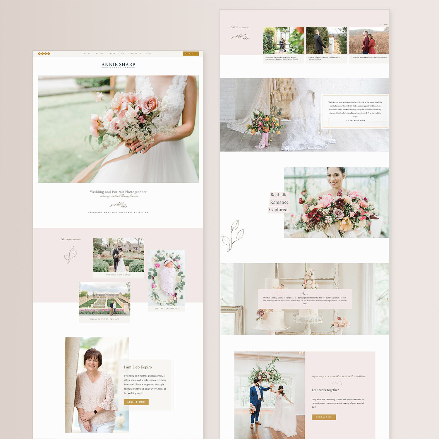
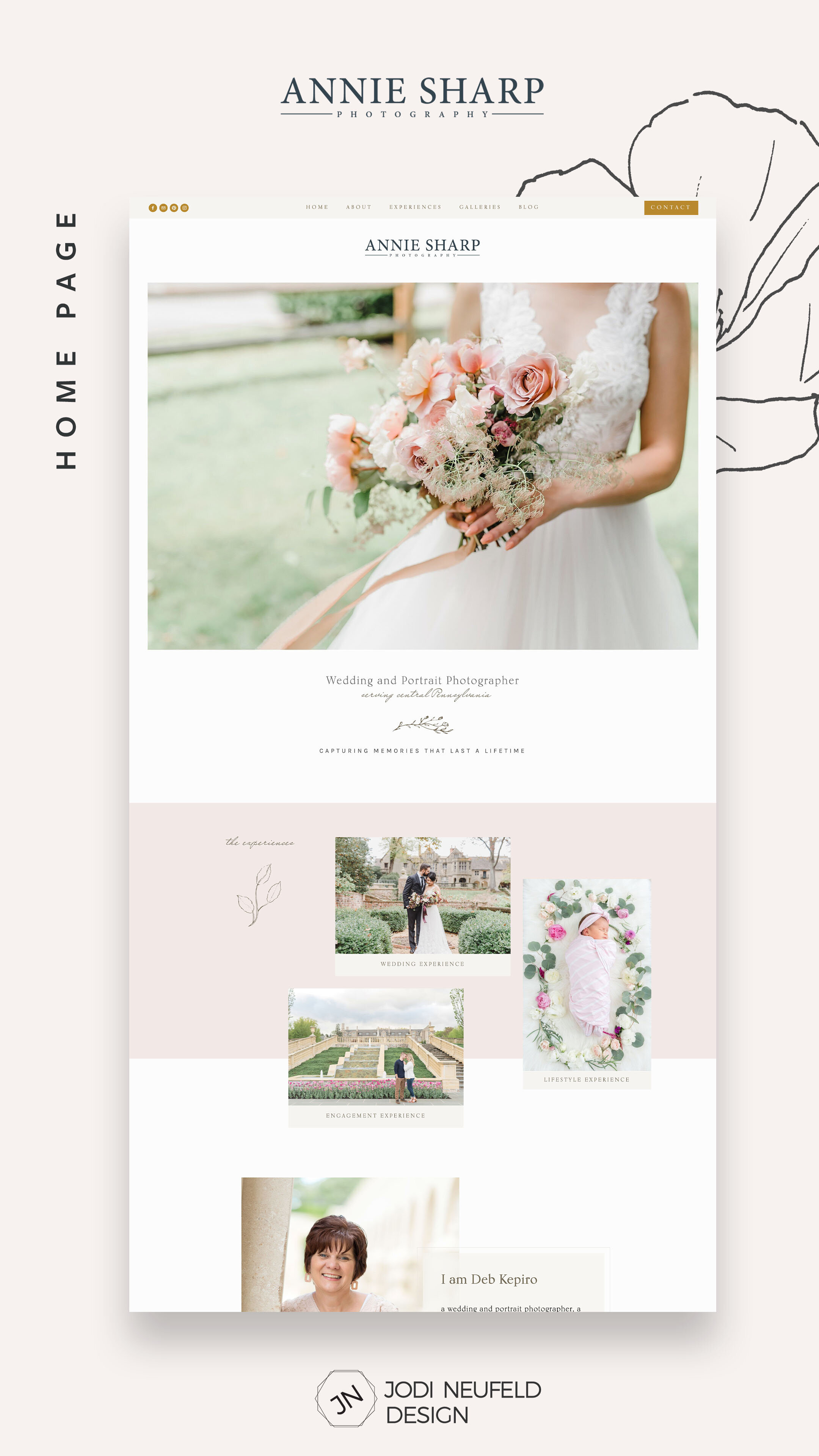
Photography home page
“I love the professionalism of the site from the colors to layout and special touches that Jodi added. I feel the site is very sharp and clean and current. I love that Jodi captured my ideas which were very random but in the end saw what I had in my mind and add even more touches to it. I also love that Jodi is always mindful of SEO which is so important! This site design was even beyond what I hoped for!”
The new home page has a layout which shows off her gorgeous photography and provides clarity on what Deb does and where to go to find out more.
The botanical graphics throughout the site are just gorgeous and provide such a custom touch.
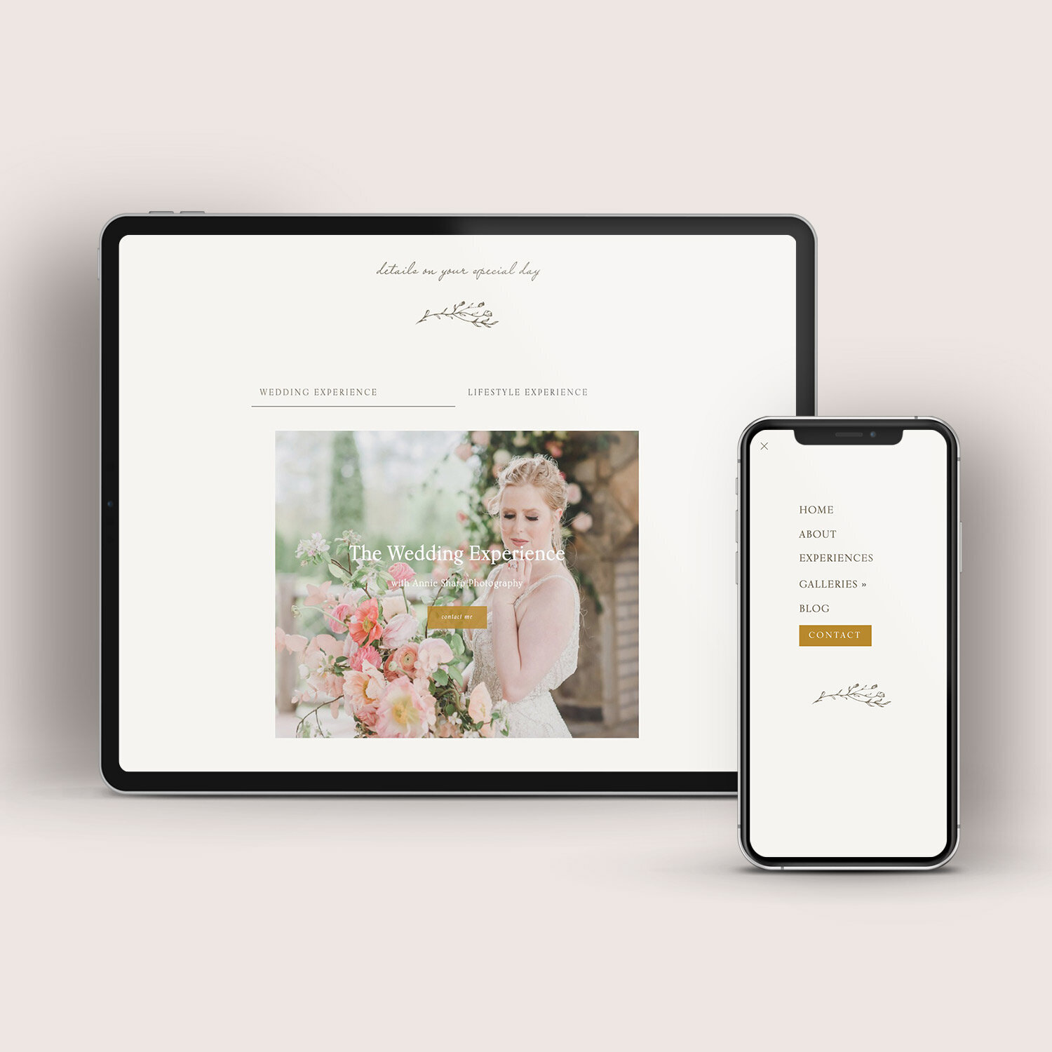
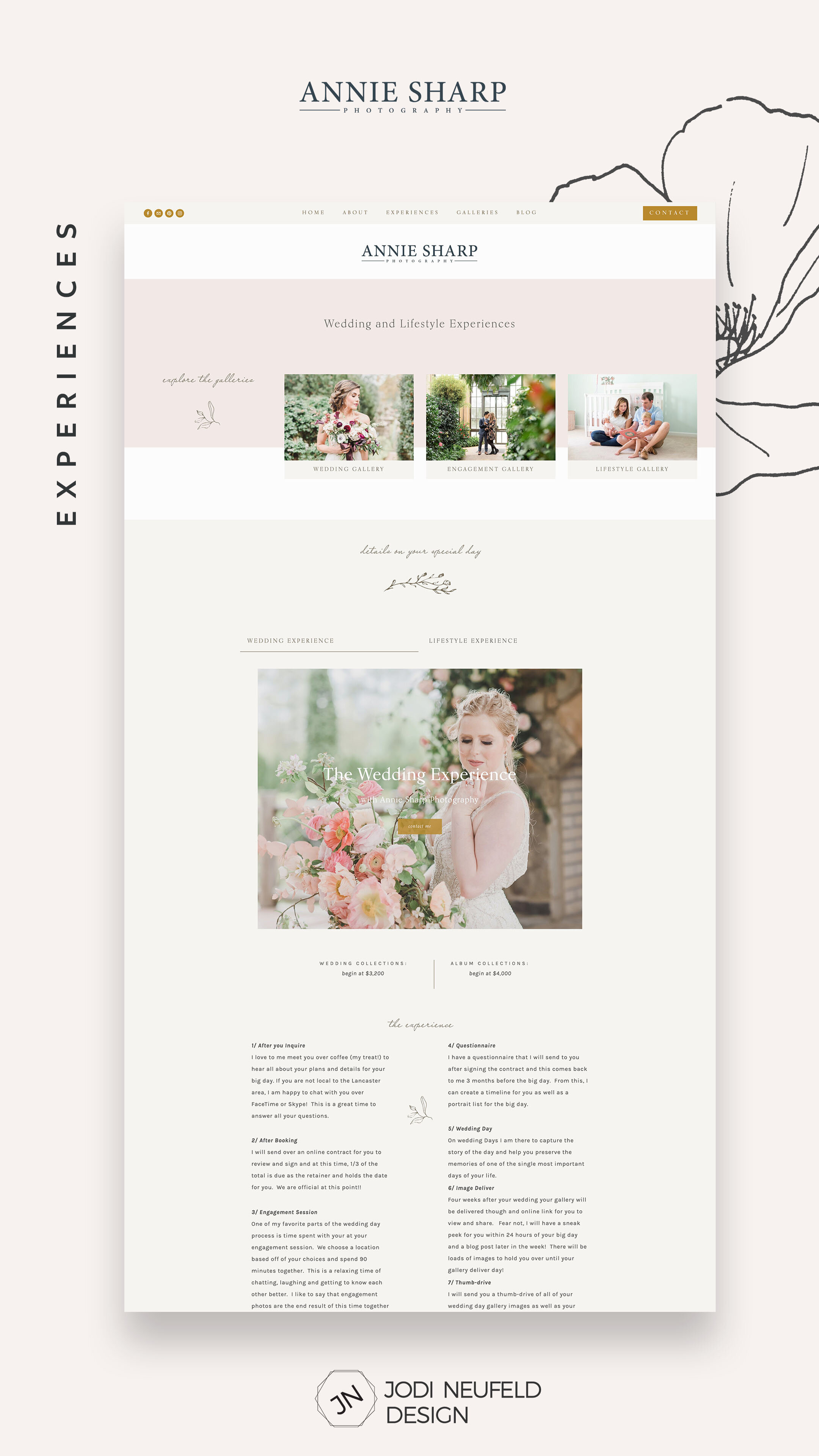
Mobile Menu and a custom Experiences page
As is the case with all my website designs, thoughtful custom touches are added to not only make the site look fantastic, but make it easy to for your visitors to find information.
The mobile menu was enhanced with the brand colors and a custom graphic so even it is not forgotten.
The Experiences page was designed using the Tabs Squarespace plugin from Sqspthemes which provides for a wonderful using experience as the visitor can toggle between the Wedding Experience and the Lifestyle Experience.
About page fun elements
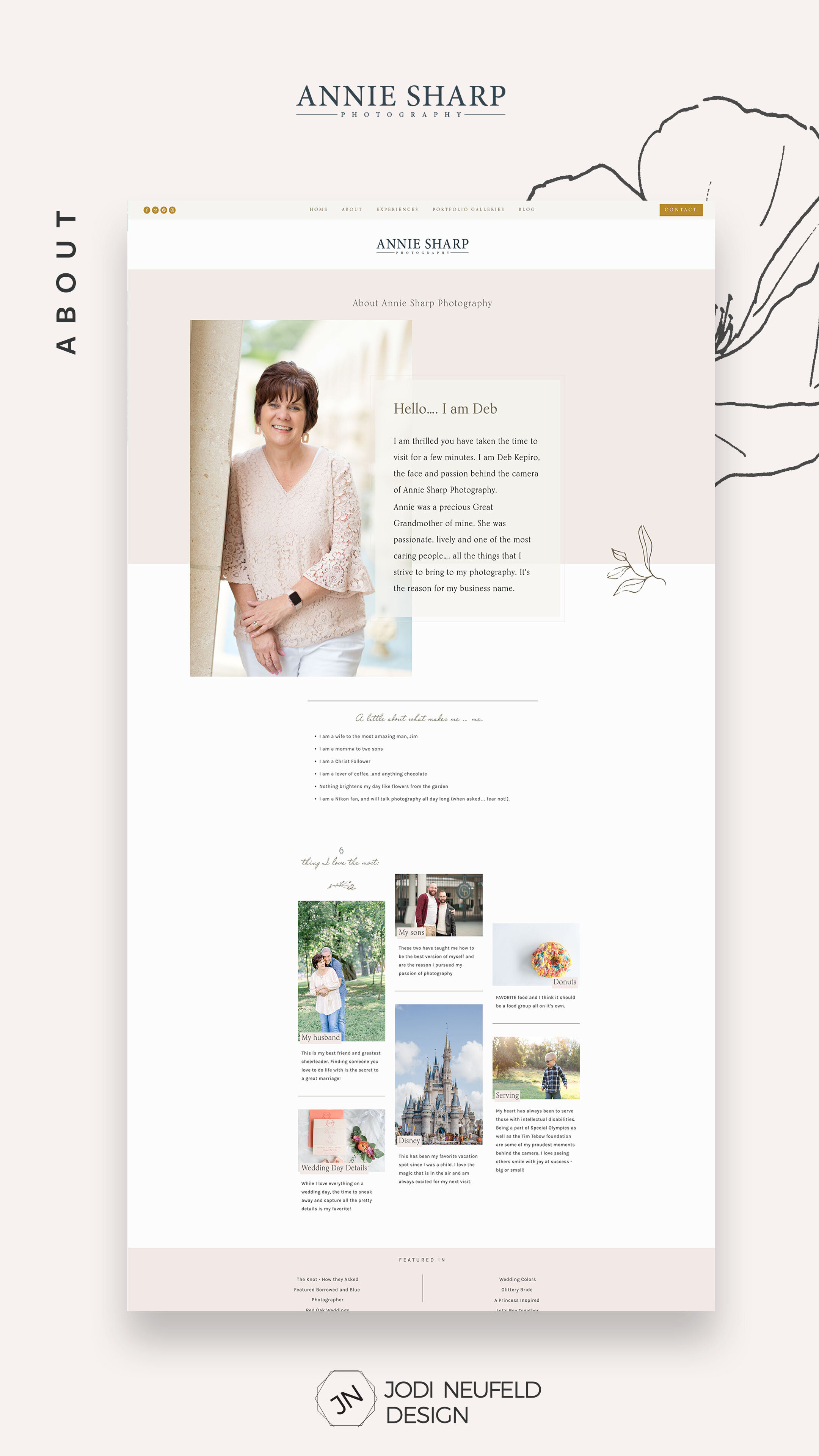
The about page is always a great page to express your personality and what make you “you” :). Here we included 6 things that Deb loves the most which was also a chance to showcase more of her beautiful photos.
Blog and Contact page
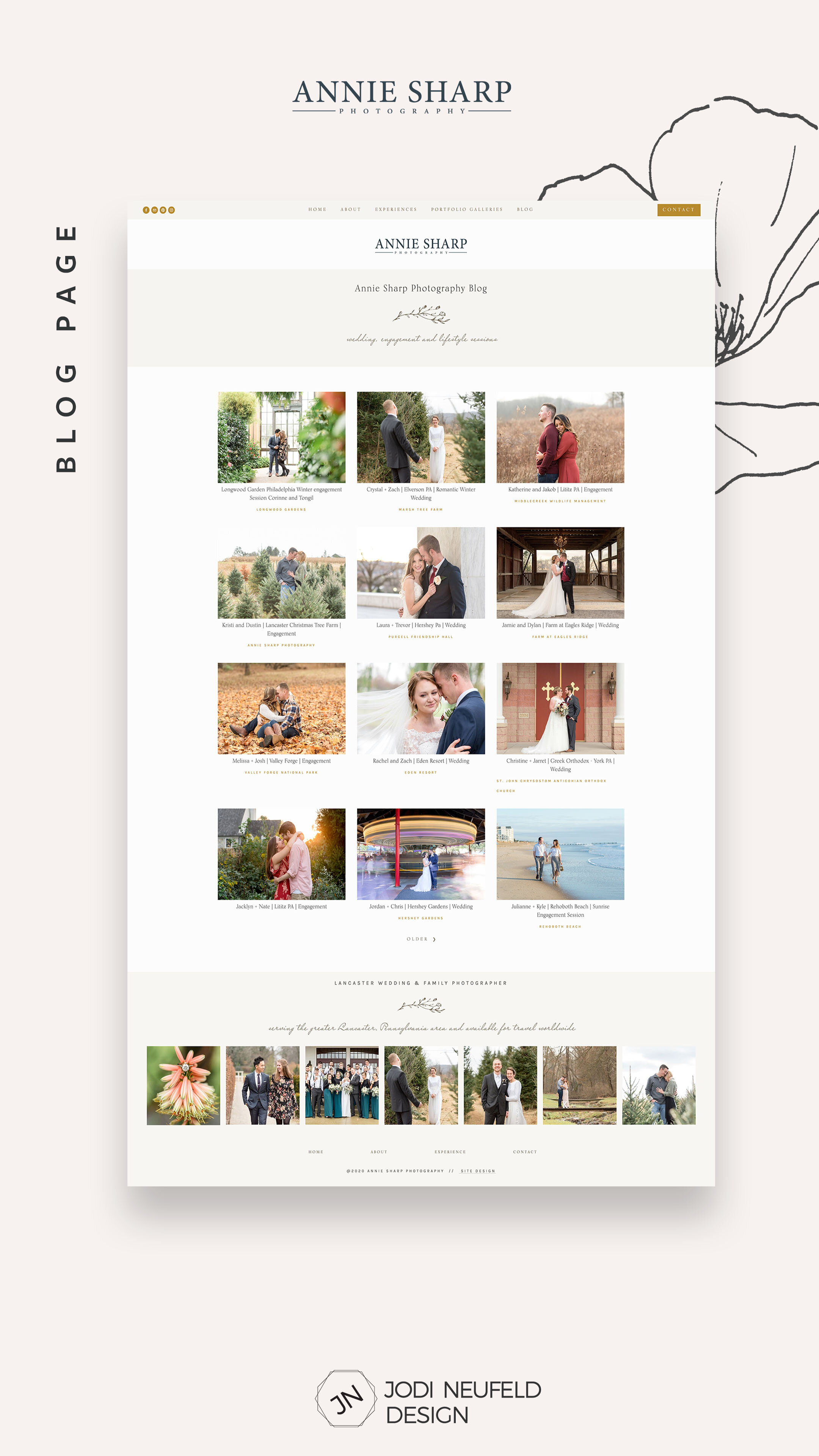
Using the Brine template families allows us to show a grid summary for the blog and showcase photos in a wonderful way. This also improves the mobile experience for visitors as there is less scrolling since the entire blog post does not show.
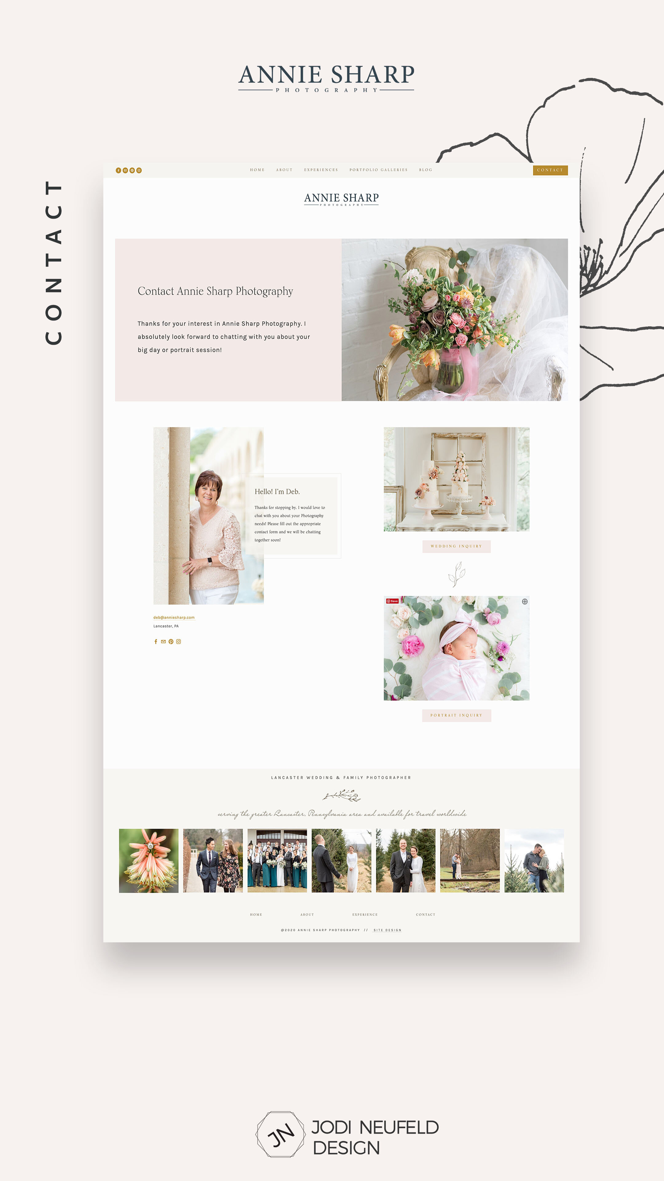
Even the Contact page is pretty!

