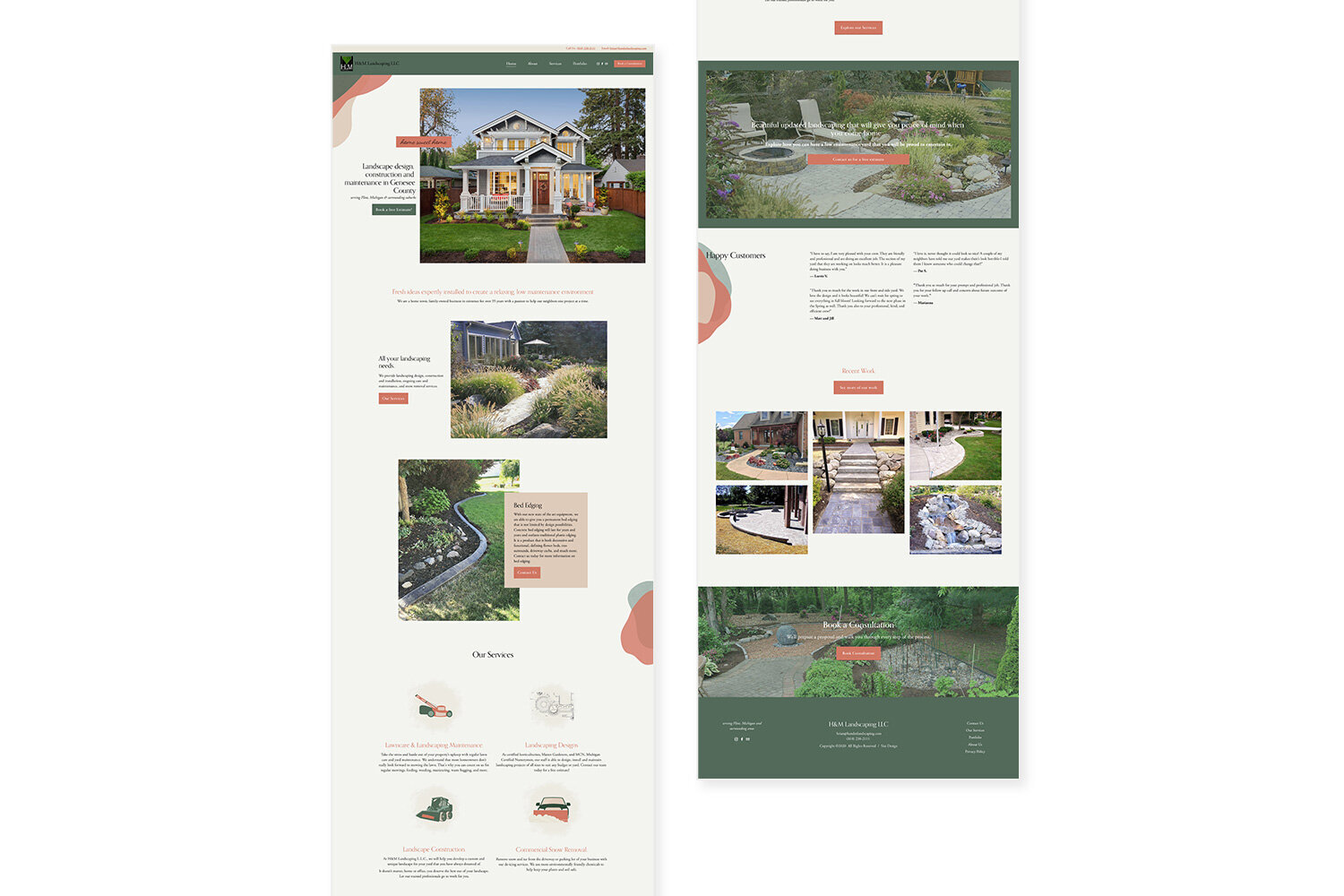
H and M Landscaping website design
So many landscape websites on the web look pretty much the same. The yellow pages type website. Well not this one!
From the beautiful colors to the custom graphics and icons, this landscaping site will stand out from all of the rest!
Home page
We used organic vector shapes to mimic garden bed shapes and create such a unique eye catching design.
Custom icons were made for the services.
The Services page for this landscaping company details their services and what they offer, but also shows off their work to highlight what they do.
The About page also features the company owners with their personal story and what set’s them apart and once again showcases their beautiful landscape services.
Services page
About page
Home page
Contact page
Custom icons on the Home page great an on brand way to display what services are offered and communicate it in a visual way.


