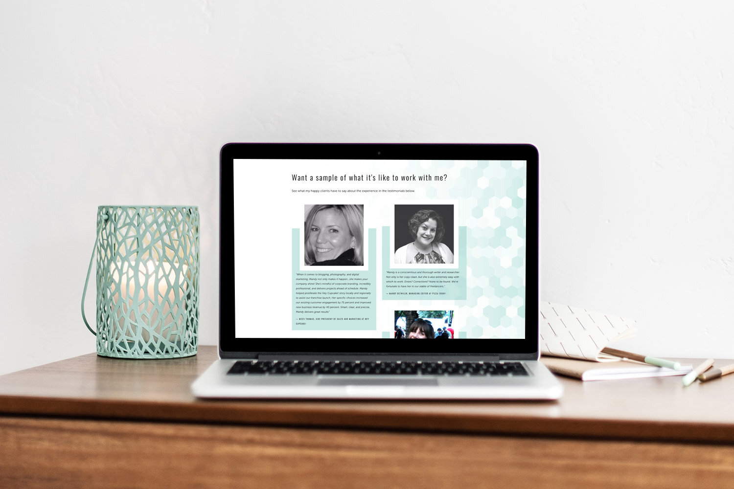
Mandy Ellis - Freelance Writer website
Mandy Ellis is an Austin based freelance writer who already had a Squarespace website which she had set up herself. She was looking for a new website to create a more professional image for her business.
What inspired your web design project? What pain points did you have when you approached me?
I struggled a lot with the overall design and also that my portfolio was an unsearchable monster. I really needed something more clean and professional that spoke to the experience of working with me. I really struggled with mixing white space, color, and images, and I think what I have now just rocks so much.
“I want my website to feel modern, fresh, luxe, fun, and professional. I’m hoping that it gets across my personality, but also that I take my work seriously and deliver for my clients.”
The first step in the process was to create a high end branding package for her which her brand designer did a beautiful job of. Her elegant branding was the jumping off point for Mandy’s new website as well as the fun pattern she designed that summarizes the topics Mandy writes on.
I was inspired by the geometric shapes within her logo and used this inspiration to create some fun triangle graphics that were more loose and organic in shape and captured some of Mandy’s fun personality.
The Home page
The Home page of Mandy’s site was designed with the goal of attracting new clients by showing them what kind of work she does and encouraging them to explore her writing portfolio.
The graphics and colors used show off Mandy’s fun personality while maintaining a professional presence.
The testimonials section even had a fun design which incorporates a hexagon pattern in her brand colors.
“Jodi definitely listened to everything I wanted to add into my website. She was patient with all my direction and changes, came up with a killer pattern that she used throughout the site that connected to my logo, and had creative ways of putting a ton of information onto each page. She also gave great input on what would look good on mobile and desktop so it’s easier to see what a potential customer would see if they visited the site on either device. I love every page she created!”
The Mobile Menu
The mobile menu even got a special touch with the design of a custom menu incorporating fun triangle graphics and Mandy’s brand colors.
The About page:
The About page captures Mandy’s personality with multiple graphics and colors. The design remained cohesive with the Home page but more fun elements were incorporated to create a page where visitors could get to know Mandy better.
“I love it! I love all the designs, the layout and the images. I feel like you totally got the whimsy in the triangles and the hexagons and pulled all the random things I wanted into one cohesive design :).”
The Portfolio page:
One of Mandy’s main requests was to have an easy to navigate portfolio that was searchable and could be filtered by topics and types of writing assignments. I used the Universal filter from Squarespace Websites to achieve this easy to navigate portfolio.
Intro Guide (Welcome Package)
When Mandy gets inquiries now she can send a beautifully designed welcome page that lives right on her own website. This page will be easy for Mandy to edit herself now. It’s so much easier to edit a web page than to update a document in InDesign or somewhere else and upload as PDF every time you want to make a change. Now Mandy can easily edit it and it also incorporates her scheduler from Dubsado. Having it as a page on her website allows us to add interactivity as well.


