How to set up your header layout on the Brine 7.0 template in Squarespace
The Squarespace Brine family of templates are the most customizable templates on the Squarespace 7.0 platform including the Header navigation options. These are the template families I use to use all the time for my custom website designs and one of the many reasons is the ability to customize the header area. Note: since Squarespace has introduced a new version I now start new websites on the 7.1 platform. You can read about the differences between Squarespace 7.0 and Squarespace 7.1 here.
Because there is so much design flexibility, many people get confused on how to set these headers up. This post will break that down today to show you all the ins and outs of the Brine template header options.
So what is a header area anyway?
The header is the area that appears at the top of every website with navigation links that allow your site visitor to navigate around your site. The header area can have navigations links as well as other information such as your social icon links, a shopping cart icon, a search bar and branding.
Brine template navigation areas
There are 3 navigation areas on the Brine family templates, the primary navigation, the secondary navigation and the footer navigation. We will look at the primary and secondary navigation options today here.
Top and Bottom header areas
The Brine family templates have 2 header areas: the top header and the bottom header. Within these 2 sections there are 3 areas: left, center and right.
This is depicted by the this diagram of 6 quadrants: 3 across and 2 down.
You can put multiple elements in each quadrant, but you have to be cautious with this as some elements can overlap and looked squished. Typically it works best with only 2 quadrants in use per row as well.
example of a “squished navigation area
The other thing to note is when you have lots of navigation links in one menu (ie Primary) then often what happens when viewers view it on a narrower device screen, the navigation spills over into 2 or 3 rows. This is especially noticeable when the navigation is placed in the “center” area.
Here are some of the possible elements you can add within these quadrants:
Site title or logo (“branding”) - upload your logo or input your site title via the Design -> “Logo & Title” option
Tag line - the option to control where the tag line can be shown will only show after you have entered a tag line in the Design -> “Logo & Title” page
Navigation links - under the Pages panel create or drag pages under the Primary Navigation area and/or the Secondary navigation area
Built-in social icons - the social icon options will only show if you have set up your Social Accounts under Settings -> Social Links panel
Search bar
Shopping cart (for commerce plans)
Sign In / My Account link (for commerce plans)
To have these elements appear, open up the “Site Styles” panel and underneath the “Header: Layout” area find these specific elements and change the default value from “hide” to the appropriate area that you want them to show (ie top right)
How do you make navigation horizontal or stacked?
If you have more than 1 element in a “quadrant” (ie. top center) you will have the option of whether you would like to display them in a stacked(vertical) or in a horizontal view. Note that each element in this quadrant will display this way based on your setting.
Bottom header
The bottom header displays page banners as background images or videos. If there's no banner, the background color is the same as the page (Color in Main).
Here is a guided walkthrough of how to set up your header area on the Brine family template with some examples of what you can do:
How do you set up a centered logo with navigation on either side? Watch the video to learn:
Styling the Brine header on mobile devices
One other thing I love about the Brine family templates is the ability to style the header area differently on mobile. There are options to change the logo size, logo position, the fonts etc.
You can also force the mobile navigation to come on at a certain pixel width if you are not happy with how your site looks on a slightly larger screen (such as a tablet).
According to Squarespace - social icons and tag lines will not display on mobile. If you add a search icon it will open an overlay search bar.
Watch the video below to see more about mobile styling on the Brine header:
How about some examples of different navigation areas on the Brine?
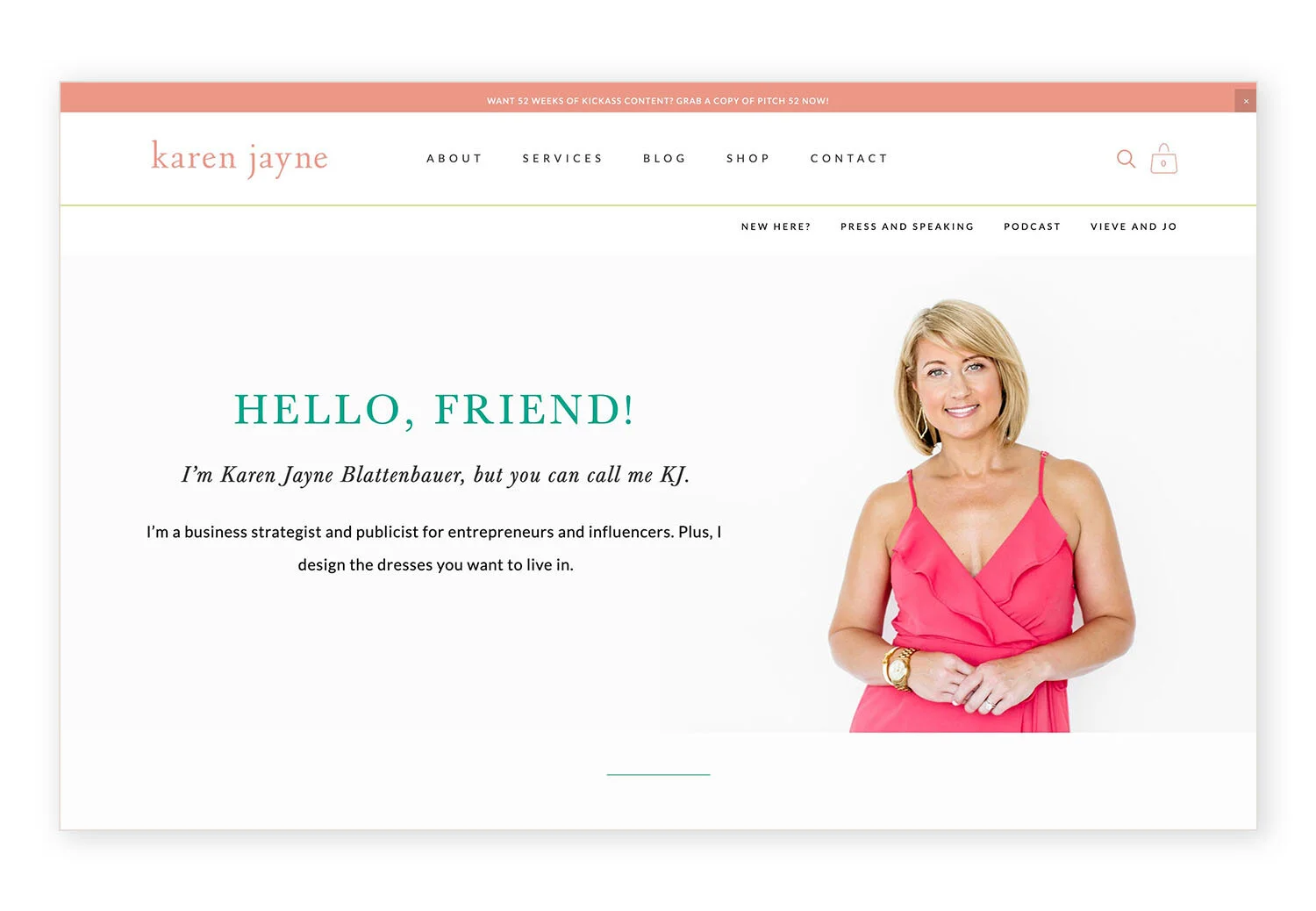
Here are some websites using one of the Brine family templates that show the different options you can have along with the settings from the Style panel (note that some of these examples also use custom code to set the background color of the bottom header area or add a border to the bottom header area).
There you have it! If you need a reason to switch to the Brine family templates on Squarespace then this just may be it! Just using the style editor settings allows you so much flexibility and then adding in custom coding can accomplish even more towards a very custom, unique header on Squarespace.


