Squarespace 7.1 vs Squarespace 7.0 - which one should you use?
*updated March 2024
One of the most common things I do when on my Squarespace Design Day service is to move clients from 7.0 to 71. I have moved 50+ clients over on my Design Day and as a part of this service we have a consult call and strategy call. These are some of the common questions I get all the time on these calls.
Table of Contents:
What version of Squarespace is my website currently using?
Is Squarespace 7.0 going away?
Are there different templates for Squarespace 7.0 vs Squarespace 7.1?
How do I change templates in Squarespace 7.1?
What is the difference between styling your site on Squarespace 7.0 or Squarespace 7.1?
What are the differences between the header areas on Squarespace 7.0 and 7.1?
What are the differences between the footer areas on Squarespace 7.0 and 7.1?
What kind of Gallery sections/pages can you have on Squarespace 7.1 vs Squarespace 7.0?
What kind of portfolio pages exist on Squarepace 7.0 or 7.1?
Is Squarespace 7.1 better than Squarespace 7.0?
Is it is worth switching to Squarespace 7.1?
How do I switch to Squarespace 7.1? : Migrating content from 7.0 to 7.1
What is Squarespace 7.1?
Squarespace 7.1 is the newest version of Squarespace that was officially launched at the beginning of 2020. There were very mixed reviews when it first came out, but, since then, Squarespace has done a good job of fixing issues and adding in incredible functionality to Squarespace 7.1 that allows it to be “cutting edge”. There are so many new features including the new Fluid Engine editor which allows us to create layered designs, streamlined settings that make it easy to change global colors and fonts and so much more that I will cover in this article.
While the new version still is missing some features that we got used to on the Brine family templates on 7.0, there are many new features that were introduced in the 7.1 platform which make it very appealing.
In this post, I will mostly be comparing the 7.0 Brine family templates with the new 7.1 version to differentiate between the two offerings. The reason for this is the Brine family templates are the most used option in Squarespace 7.0 and offer the most flexibility of any of the 7.0 templates.
What version of Squarespace is my website currently using?
Not sure if you already are on the new Squarespace 7.1 platform?
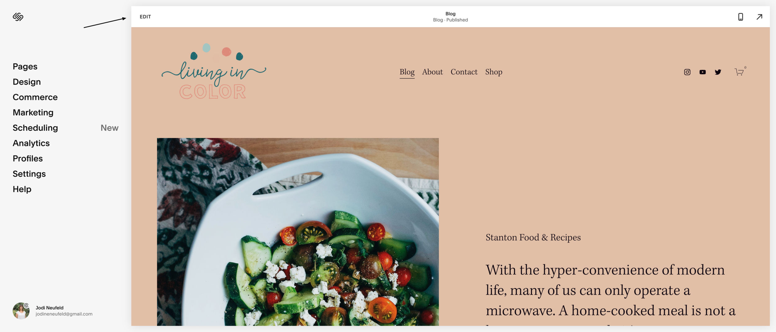
Odds are, that if you have a site that was started in 2020 then you are already on the 7.1 platform. You can easily tell by logging into your site. If you see the Edit bar at the top of your page that looks like this then you are on 7.1 already.
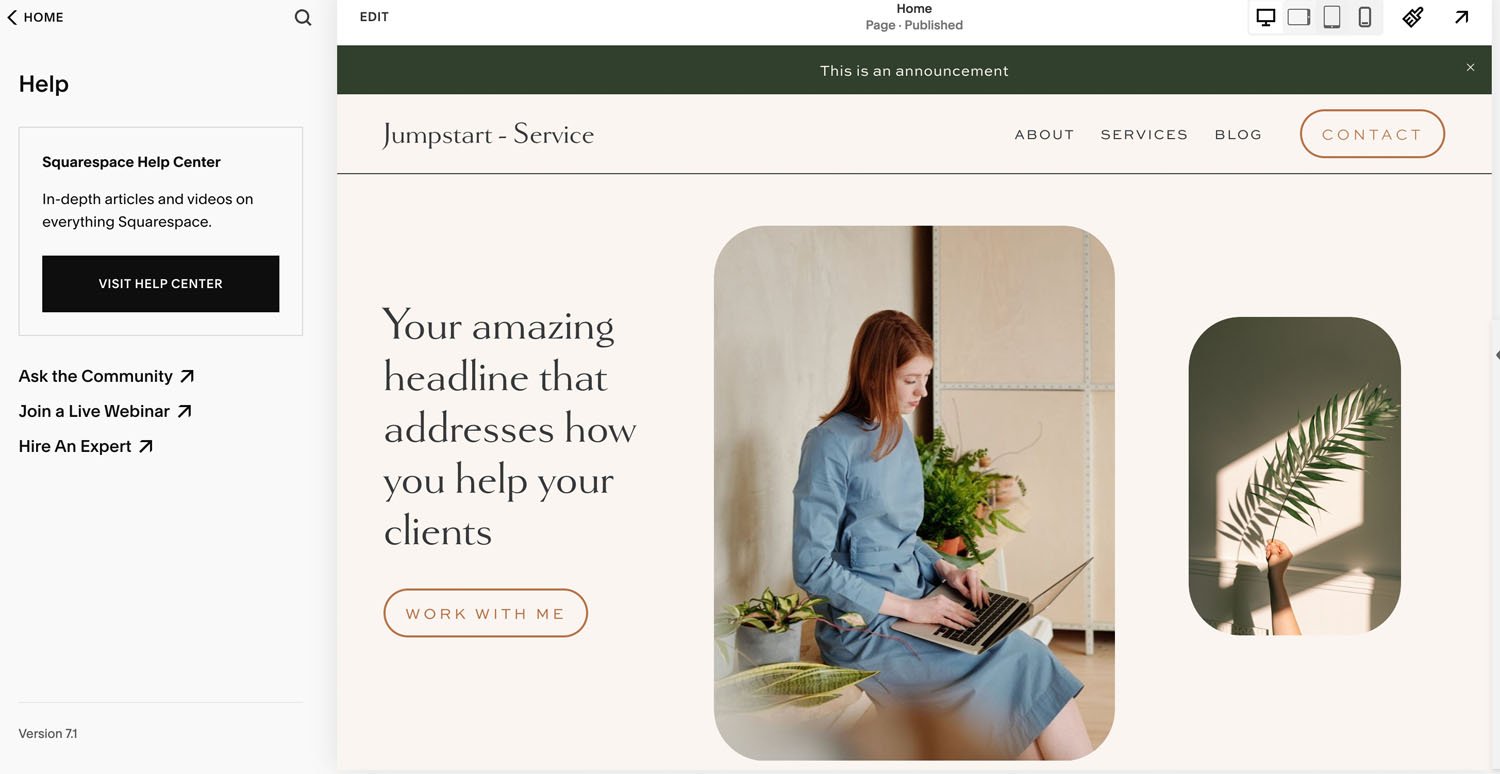
You can also tell easily what version you are using by going to the Help page from the main menu in squarespace as shown below. The version appears in the bottom left corner of the page. If you are on Squarespace 7.0 your template name will also appear.
All new sites started on Squarespace now will automatically defer to the Squarespace 7.1 templates. If you want to you can still access the Squarespace 7.0 templates here.
Is Squarespace 7.0 going away?
At this point Squarespace has made a commitment to keep supporting Squarespace 7.0 indefinitely so you are not forced to move your site over if you are not ready. Just keep in mind that all new development and efforts are going to be focused solely on the Squarespace 7.1. As time goes on the differences between the two platforms will just continue to increase.
Are there different templates for Squarespace 7.0 vs Squarespace 7.1?
The first difference between 7.0 and 7.1 is the template options.
In 7.0 you have the option to pick a template family and each of these template families vary greatly in their capabilities. This means you have to have a good idea of what look you were wanting ahead of time and the overall style of your site. You can still change templates in 7.0, but it does take a bit of work and time.
In Squarespace 7.1 there is only one base template. Squarespace shows different options when you start a new website, but all of these templates are the exact same template family. You will never need to switch templates on 7.1 as all these templates have the same functionality. The only reason you see different options is that Squarespace is trying to help speed up your site setup as you can pick a template that already has a layout or fonts that you like to jumpstart your site setup.
Which option is better? : I am a big fan of not having to commit to a template and being able to style any template the same way so this one goes to 7.1
How do I change templates in Squarespace 7.1?
Since the is only ONE base template in Squarespace 7.1, there is no option to switch to a different template. All base templates just look different based on the content added, layouts chosen and the fonts and colors being used.
What is the difference between styling your site on Squarespace 7.0 or Squarespace 7.1?
This is where things get very different between the 2 versions of Squarespace.
In Squarespace 7.0, you can access design styles for any available element that you currently see on the page preview in the right when you are in the “site styles” panel. This is good and bad. Good because everything is in one place, but bad as you don’t always see every available block unless you create a page on your website exclusively for this purpose that has every block on it.
Changing styles in Squarespace 7.1 is much easier to do now since the changes are more “global” In Squarespace 7.1, the design styles are separated by category so you have to decide what you are wanting to update first and go into that specific panel. For instance, there are separate menu options for buttons, fonts, image blocks and colors. This does add lots more “clicking around” to set up all of your styles which many designers are not thrilled with. However, even though it may take more clicking, there are definitely more options nested within these menus.
Font styles
Squarespace 7.0
Pros :
You can easily use a different font family and style headings or buttons differently. So for instance your heading 1 could be a different font family than your heading 2.
Cons:
There are less heading and paragraph options. Only heading 1, heading 2 and heading 3 and then one body text option.
The image layout blocks only have a title and subtitle area so our font styles are limited in these blocks.
Squarespace 7.1
Pros:
Global edits for typography is easy. For instance you can style all of your buttons to have the same font and then adjust the size of the large, medium and small button in one place.
Squarespace 7.1 has “font packs” which allow for easy global font changes to your site. The template you pick comes with a base font package, but you can edit it by selecting “SWITCH” and then deciding if you want to use all Sans-serif fonts for your heading and body, all serif fonts, or a mix of the two. Pick a style that closely matches what you want and then you can further customize by selecting that font pack and then return to the main font style panel where you can adjust global text styles for headings, paragraphs, buttons and other miscellaneous options
There are more heading and paragraph (body) styles available in Squarespace 7.1:
Heading 1, heading 2, heading 3 and heading 4 (heading 4 is not available in 7.0)
For paragraphs these options are available: paragraph 1, paragraph 2 and paragraph 3 (only 1 paragraph style in 7.0)
All heading and paragraph styles are now available in the image layout blocks!
Cons:
You cannot change the font family of one of your specific options (such as a heading 2 or paragraph 3 or a medium button) without having to use custom code. So all headings have the same font family and all buttons have the same font family unless you use custom code.
Color Styles
Squarespace 7.0
Pros:
Global color changes are simpler in Squarespace 7.0. As long as you have a page where you can view the applicable element you want to change, you will see it in the Site Style panel and can make any color changes there.
Cons:
It is not possible to change colors of elements on a section level. For instance, to change a section in an index page to have a different colored background, you either have to use custom code or add a background image that is a picture of the solid color. To change the text color for that section you would also need custom code.
Squarespace 7.1
Pros:
This is where there is a huge difference between 7.0 and 7.1. 7.1 allows you to have differently styled color sections which they call “Section Themes”. You first start with setting your base color palette and then you need to go into each individual theme to set up the colors of all potential block elements.
This allows us to change background colors and all font options based on a section. Having this option allows for a great amount of flexibility when designing a site without having to use custom code
You can easily add a banner image with a unique overlay color over it as well to create even more design options.
Cons:
Setting up each “Section Theme” takes a great deal of time (but is worth it for the added flexibility for your site look and feel!)
For some reason, the color sections in 7.1 do not allow the option to change the background colors in the image layout blocks (ie the card block, collage block). You can change the button colors, font colors and image overlay color, but not the background color behind the content area. For this you will need custom code.
Here is a video on how to setup your colors on Squarespace 7.1:
Buttons:
Squarespace 7.0
In 7.0 your button styles can be different for the small, medium and large button without using custom code. You can change the style, if it is solid or outlined, has rounded corners and the colors of the different buttons so that they look differently.
Squarespace 7.1
All button changes are global to the different button types (small, medium and large buttons) unless you use custom code.
To style your buttons you will need to go into 3 different menus to adjust the settings:
The Button menu to change the style of the button (solid or outline), the shape of the button (square, rounded or pill) and the button padding.
To change the button fonts you will need to use the Fonts menu and then select “Buttons”
set the color of the buttons in the individual color sections or “Section Themes” under the Colors menu
Again, in 7.1 it is definitely more work to set all of this up, but once it is set up you have more options for button colors in your various color sections, but you do not have the option to change your button styles or fonts without using custom code.
Animations
Squarespace 7.0
In 7.0 you can only add animations on individual image blocks unless you use custom code.
Squarespace 7.1
In 7.1 you can easily add global animations to your site as well as having the option to still add animations on individual image blocks.
To add global animations, from the Design menu select “Animations” and select one of the options for animation style there.
As of this writing there are only 4 animation options (fade, scale, slide and clip). You can also adjust the speed of the animations in this menu. Selecting the style will show you a preview of the animation on the page you are currently previewing. You can turn off animations globally by selecting a style of “None”.
What is the difference between editing your web pages on Squarespace 7.0 and Squarespace 7.1? Does Squarespace 7.1 have index pages?
Squarespace 7.1 does not have index pages but each website page has the benefits of index pages without the drawbacks:
Page Sections vs index pages:
One very major difference between 7.0 and 7.1 is in the way long pages are laid out in sections. In Squarespace 7.0, if you needed to use a template that supported index pages to achieve long scrolling pages with sections, but in Squarespace 7.1 all pages allow for sections. This is a huge improvement for so many reasons!!!!!
Squarespace 7.0 index pages
Pros:
In 7.0 we have the option to name the slug or URL name for each section and then link to it easily or target it using custom code.
In 7.0 we can easily duplicate a section of an index page and use it on a different page.
Cons:
You have to click in each page section separately to edit it even though the sections are part of the same page
Squarespace 7.1 page sections
Pros:
You can ddit any section with the current page without any further clicking required.
In 7.1 Squarespace provides a ton of predesigned layouts that provide a great starting point for each page type.
Easily change the styling for the section by using the section color themes!
Here are some things you can change:
The section color theme and all the styling setup with that theme
The section height and width
The alignment of the content within the section
Add a background image to a section and select whether it is going to display edge to edge “full bleed” or to have an inset with a border around it. (The border color is determined by the section theme being used in the color tab)
Adjust the amount of the overlay opacity by using the slider on the background panel
Change the color of the overlay opacity by changing the color theme and setting it up in the Site Style panel or Theme Editor
Cons:
We can not easily target these sections as there is no place to name the section. You need to either inspect the code to find the unique section id or use this plugin to easily find the section id to target.
Pre made layouts in Squarespace 7.1:
What are the differences between the header areas on Squarespace 7.0 and 7.1?
Squarespace 7.0
One of the biggest advantages of the Brine family templates is the ability to customize the header to achieve a great variety of layouts. The Brine family templates allow for a secondary navigation which is a great way to organize the navigation area and style it differently.
Squarespace 7.1
With 7.1 we are more limited in our header area since there is only 1 navigation area available.
To get around this limitation there is an easy solution though! This plugin by Will Myers is super affordable and allows you to add in a secondary navigation easily on 7.1! This plugin provides similar options to what we have been used to having on the Brine family templates.
In 7.1 there are different options for editing your navigation bar for desktop and mobile which allows for more options without having to resort to code.
Editing the header in Squarespace 7.1:
What are the differences between the footer areas on Squarespace 7.0 and 7.1?
Squarespace 7.0
Using the Brine family template, we have 3 section options for the footer area on our website (top footer, middle footer and bottom footer). Unfortunately without resorting to code there is no easy way to change the width of the sections or the color of the sections backgrounds.
Squarespace 7.1
With 7.1, we can have as many sections as we want in our footer and we have the same access to the section options that I mentioned previously. For example, you can change the background color, add a background image, change the inset, section height, width and alignment for each of the footer sections. So much more control than with 7.0 for the footer area!!!
Editing the footer on 7.1:
What kind of Gallery sections/pages can you have on Squarespace 7.1 vs Squarespace 7.0?
Squarespace 7.0
In 7.0 we have the option to store images in a gallery page. We can then have the option of accessing these photos from a summary block or a gallery block to display the images in multiple places on our site.
Another option in 7.0 is to use index gallery sections in templates that allow index pages. The index gallery options allow for a slideshow or grid option.
7.0 definitely has the advantage in the gallery department because we are able to access our photos anywhere on our site.
Squarespace 7.1
In 7.1 there are no more gallery pages (unless you are a circle member). This means we have no option to build our site in way to display our images in multiple places on our website without creating duplicate gallery sections and uploading the same photos.
The gallery “sections” in 7.1 are similar to the index gallery option on 7.0 but with more options for layouts:
In 7.1 the gallery section options are:
Grid: Simple - A grid of images in even rows and columns
Grid: Strips - A grid where strips of images display at different sizes in each row
Grid: Masonry - A grid where images appear in a staggered layout
Slideshow: Simple - A simple slideshow that displays one image at a time
Slideshow: Full - A full-bleed slideshow that displays one image at a time
Slideshow: Reel - A slideshow where multiple images display at once, like a film reel
Gallery sections in 7.1:
What kind of portfolio pages exist on Squarepace 7.0 or 7.1?
Portfolio pages are a new feature in Squarespace 7.1. These collection page types do not exist on Squarespace 7.0. On Squarespace 7.0 we can use blog collections or galleries but there is no specific collection available for portfolios.
These pages are essentially landing pages that link to subpages either using text headings or images in a gallery. There are some awesome options for laying out your portfolio gallery built in :
Grid: Simple - Arranges the thumbnail images in a grid layout. Title text for each sub-page appears below the images.
Grid: Overlay - Arranges the thumbnail images in a grid layout. Title text for each sub-page overlays the images.
Hover: Background - Displays the sub-page titles in a stacked or inline layout. When hovering over a title, the sub-page thumbnail replaces the section background.
Hover: Fixed - Displays the sub-page titles in a stacked or inline layout. When hovering over a title, the sub-page thumbnail displays smaller in a fixed position in the section.
Hover: Follow Cursor - Displays the sub-page titles in a stacked or inline layout. When hovering over a title, the sub-page thumbnail displays smaller and follows the cursor as it moves.
These options would then link to a sub page where you can go into detail about a project or gallery. These sub pages are just regular pages that can have sections with text and gallery sections to showcase your portfolio items.
In 7.0 we can achieve this using a summary gallery of images that link to either their own index pages or else we could use a blog for our portfolio.
The advantage of 7.1 is that there are some really interesting ways to display the portfolio page, but both options work in a similar way.
Portfolio pages do not have category or tag options like a blog post does so this will make it hard to organize or filter them. Also, the most limiting thing about using a portfolio page is that we do not have a way to access the portfolio items using a summary block. So we could not show a selection of portfolio items from this collection on our home page!
I have a full post on portfolio pages in Squarespace 7.1 that you can read right here.
Portfolio page options in Squarespace 7.1
What is the difference between the commerce features available on Squarespace 7.1 vs Squarespace 7.0?
Squarespace is introducing Product Collections 2.0 for Squarespace 7.1 which is a total overhaul of Store pages on Squarespace to improve the foundation for e-commerce. Product Collections will allow for new ways to organize and order products in our stores , including nested categories, or subcategories. We can also manually order the categories to display however we want.
On 7.0 this type of organization of products is very limited and we need a third party filter tool such as Squarespace websites universal filter.
Other improvements to online shops for 7.1 are the addition of the new Product Composer which allows for a more streamlined way to add in all of your relevant product information.
Is Squarespace 7.1 better than 7.0?
YES it is. If you are starting a new Squarespace site from scratch then I would strongly recommend using the 7.1 version of Squarespace. Not only will you have access to new options, but Squarespace will be continuing to add new features to 7.1 and will not be updating the 7.0 version with new features anymore.
Here are some things to keep in mind when you are deciding if you are going to use Squarespace 7.0 or Squarespace 7.1:
7.0 will not be getting any new updates but Squarespace has assured us that it will continue to be supported for a long time
if you are already on 7.0 and you are happy with your current site then I would not recommend moving over to 7.1 for the reasons below
if you are ready for a site redesign and are anxious to do some site cleanup then this might just be the perfect excuse to setup a new site in 7.1
If you are starting a shop on Squarespace then I would totally recommend choosing the 7.1 platform for the new ecommerce capabilities.
there are some issues with content migration between 7.0 and 7.1 meaning, there is none…. It is a manual process of moving over content and there are certain things that will not get copied over such as your customer profiles, commerce settings like shipping policies, tax rates, Squarespace Campaigns.
There are no social sharing buttons on blog posts built in on Squarespace 7.1 so you will have to use a third party service for now like addthis or shareaholic.
If you have a lot of blog posts and comments on your 7.0 site then I would wait it out for now. Hopefully Squarespace will come up with a migration plan soon.
Keep in mind anytime you do a major redesign your SEO will take a slight dip. You will want to make sure you keep your URL slugs the same from 7.0 to 7.1 or else make sure you set up domain mappings so there are no broken links.
Keep in mind this is a time consuming process. View it as a redesign as opposed to switching templates. If your current site is not working for you right now this just might be the nudge you need to invest your time in a redesign. If you have a large amount of content you might want to stay on 7.0 for now.
There are businesses that are offering a data migration service now as well so if you want to outsource this try searching google for this service.
Is it is worth switching to Squarespace 7.1?
Yes 100%!!! Squarespace is continually investing their time and money into the new platform to make it more cutting edge. The 7.1 platform definitely represents the future of web way more than 7.0!
Here are some new sections that make it totally worth while to make the switch! (also Squarespace is constantly adding brand new things!)
Here are some powerful reasons to switch to Squarespace 7.1:
Fluid Engine editor in Squarespace 7.1
This is a true drag and drop editor that allows us SO much freedom with layouts. Layer elements such as image and text and so much more! Read my complete review of Fluid Engine here:
Portfolio pages in Squarespace 7.1
A beautiful way to display your work. Easily order your projects and display them. But these pages can be used for so many things - not just a portfolio! Read my complete review of Portfolio pages here:
List sections - Squarespace 7.1
My new favorite section in Squarespace 7.1! List sections allow us to do things like create beautiful column layouts, testimonial sliders, beautiful slideshows with text overtop and so much more! The best thing about these sections is all the control we have via the settings.
I go over the column layouts using list sections in this post:
Other new features in Squarespace 7.1
Squarespace 7.1 definitely caters to allowing us to creating sections quickly by having access to pre made layouts by section based on the type of section you want to add. We can also duplicate and reuse content much easier now with saved sections and the ability to copy and paste content. I cover all these time saving tips for Squarespace 7.1 creation in this blog post.
Squarespace continues to add more style options to Squarespace 7.1 as well such as shape blocks and sections dividers to allow us to be more creative in our website layouts without having to use any custom code.
How do I switch to Squarespace 7.1? : Migrating content from 7.0 to 7.1
There are two ways to move your content from Squarespace 7.0 to Squarespace 7.0. The first option is to use the built in option in Squarespace 7.0 to migrate your content over and the second is to start a new site and manually copy content over. There is a tool that makes it A LOT easier to copy content over! It does cost a fair bit though if you would not find use for it otherwise. For all web designers this tool is invaluable, but for those of you just looking after one website, this might not be the best investment for you.
It’s called the Squarespace Websites Tool Extension Pro Chrome Extension. You will also need the Squarespace Admin UI tweaks plugin as well to be able to move content from 7.0 to 7.1.
Here is what is supported:
Notice, all unsupported collections 7.0 (Galleries, Albums or any custom collection type) will be allowed to convert to 7.1 Blog or Products if possible.
7.0 Index Pages may be converted to regular 7.1 Page and sections. Notice, only Pages inside Index will be supported, any other collection types will be ignored.
Ready to update your Squarespace 7.0 site to 7.1?
⟶ Read all about how to update your Squarespace 7.0 website to Squarespace 7.1 here.
Want to switch over to Squarespace 7.1 and get a some designer help on a refresh? I do this regularly for my Squarespace Design Day service. It is a VIP day intensive. Read more about it here.
In Summary:
Although I resisted Squarespace 7.1 with a passion when it was first launched, I now see the benefits of it and have noticed that it is much quicker to design sites on 7.1 and that I need much less custom code to achieve similar results. With all the new features Squarespace continues to add, it a no brainer to recommend switching to the Squarespace 7.1.
For the DIYer 7.1 is a great option for setting up your first site as there are options available that were only previously available with code. They also give you a great starting point with font packs and built in color palettes that help make your site setup a breeze!

