Winnipeg Dentists website design
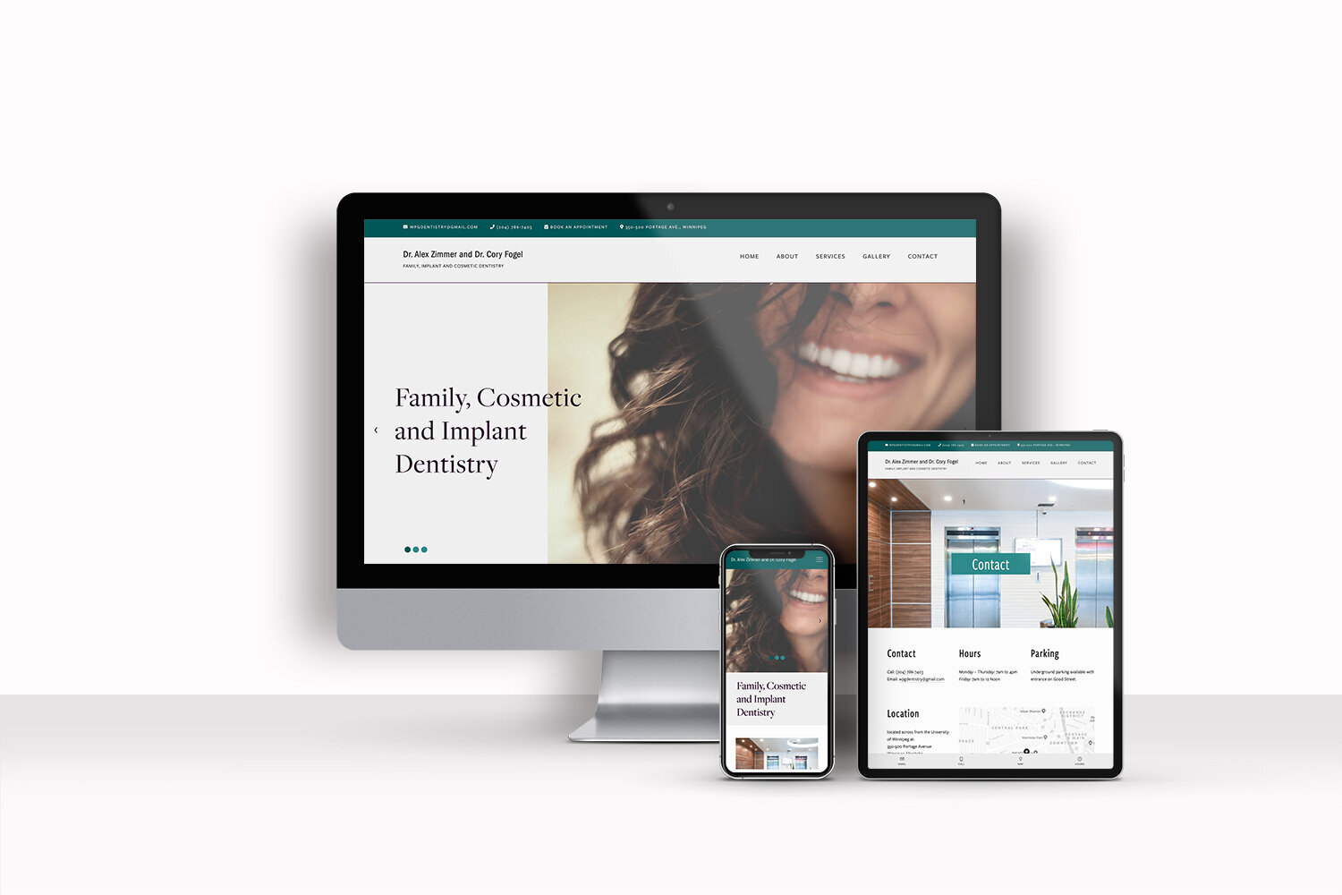
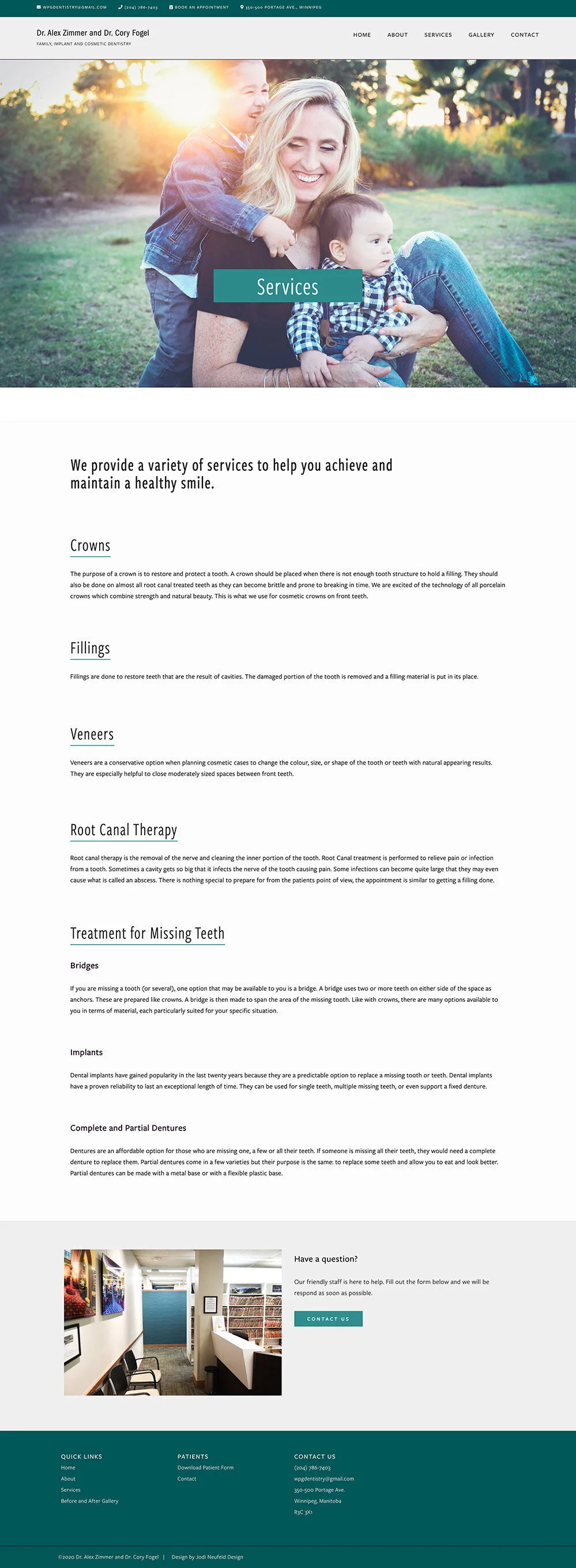
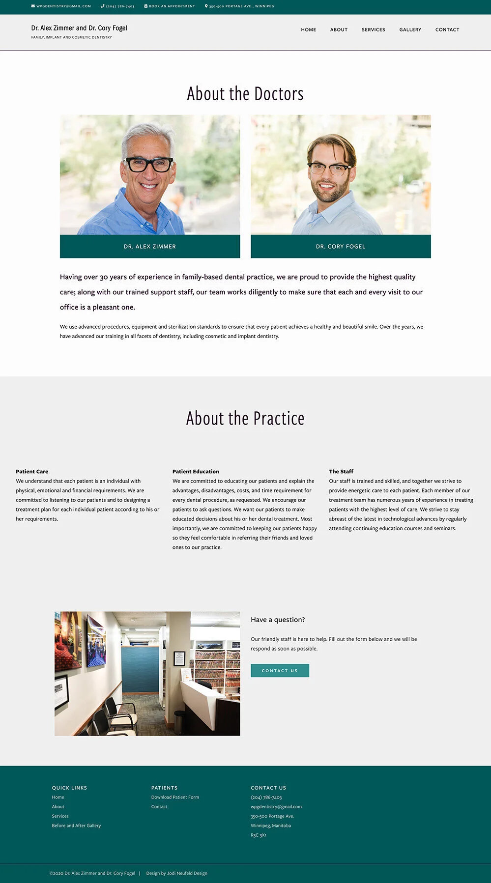
A modern and clean website design for a Dentist office
A beautiful banner slideshow, parallax scrolling with half width images, beautiful colors and most of all, easy to find information on a local dentists office brought this website into the 2000’s.
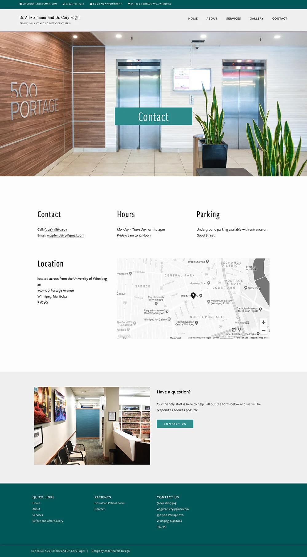
These dentists wanted to stick to a simpler website that would make it easy for their patients to find out information about their location, hours and how to contact them. Adding the information to the top area of the website makes it so easy to find along with the large map on the Home page.
Mobile design
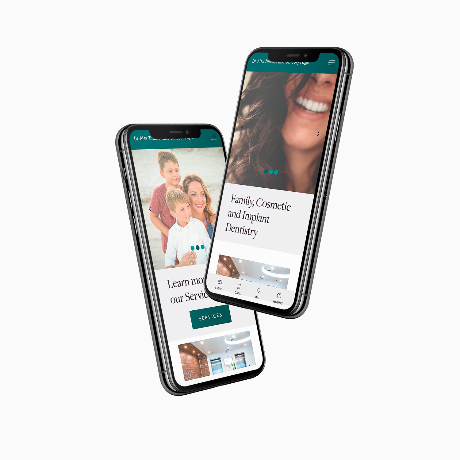

Great attention was spent on making the mobile experience of the site an exceptional one.
The contact and location information is easily accessible via the native mobile bar, as well as on the pop out navigation menu. The website pages all look beautiful on any device size.

